Steam Capsule Art Guide: Sizes, Templates, and Best Practices [2026]
Your capsule art is the first thing anyone sees when they encounter your game on Steam. It's your game's pixel-perfect first impression. Search results, the Discovery Queue, recommendation carousels, wishlists, friends' activity feeds, the homepage carousel. Every single surface uses a capsule. If yours doesn't immediately communicate what your game is, who it's for, and why it's worth clicking, you've already lost.
TL;DR: Design for the smallest size first. Your logo must be readable at 120x45 pixels. No review scores, award logos, or marketing text on base capsules. Simple composition with one mood, one character, one focal point. Genre should be obvious in under one second.
Key Takeaways
- Header Capsule (920x430), Small Capsule (462x174), Main Capsule (1232x706), Vertical Capsule (748x896).
- The Small Capsule auto-generates a 120x45 version. If your logo isn't readable at that size, redesign it.
- Valve's September 2022 rules ban review scores, awards, and marketing text on base capsules.
- Artwork Overrides allow temporary promotional text, but must be localized and expire within 30 days.
- Library Hero (3840x1240) must be artwork only with no text. Safe area is 3000x740 at center.
This guide is a companion to our Steam Page Optimization guide, which covers the full store page from tags to descriptions to screenshots. Here, we're going deep on capsule art specifically: every dimension, every rule, and the design thinking that separates a scroll-stopping capsule from a forgettable smudge. If you're pulling together a press kit alongside your Steam assets, you'll also want to read our indie game branding guide for how these visuals fit into your broader identity.
The Complete Capsule Dimension Table
Valve updated its asset requirements in August 2024. These are the current specs as of early 2026. Bookmark this table.
Store Capsules (Required Before Publishing)
| Capsule Type | Dimensions | Where It Appears | Key Notes |
|---|---|---|---|
| Header Capsule | 920px x 430px | Top of store page, "Recommended For You," Big Picture browse, Daily Deals | The workhorse. Appears more places than any other capsule. |
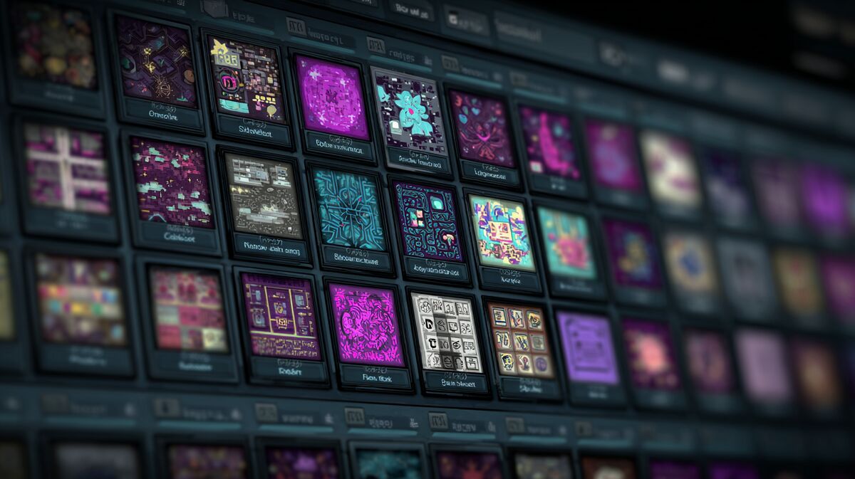
| Small Capsule | 462px x 174px | Search results, top sellers, new releases, genre lists, tag pages | Auto-generates 120x45 and 184x69 versions. Your logo MUST be readable at 120x45. |
| Main Capsule | 1232px x 706px | Steam homepage main carousel, wishlist notification emails | The big one. Personalized carousel placement based on user behavior. |
| Vertical Capsule | 748px x 896px | Seasonal sale pages, newer sale page layouts | Think movie poster. More vertical room for art. |
Library Assets (Required Before Release)
| Asset Type | Dimensions | Where It Appears | Key Notes |
|---|---|---|---|
| Library Capsule | 600px x 900px | Library overview, collections view | Vertical tile. Auto-generates 300x450 half-size PNG. |
| Library Header | 920px x 430px | Various Steam client library locations, Recent Games | Falls back to store Header Capsule if not set. |
| Library Hero | 3840px x 1240px | Top of game's library detail page | Artwork ONLY. No text whatsoever. Safe area: 3000px x 740px at center. |
| Library Logo | 1280px wide and/or 720px tall | Layered on top of Library Hero | Transparent background. Game title logotype only. Optional logomark. |
Bundle Assets (If Applicable)
| Asset Type | Dimensions | Where It Appears |
|---|---|---|
| Bundle Header | 707px x 232px | Top of bundle detail page |
Page Background (Optional)
| Asset Type | Dimensions | Notes |
|---|---|---|
| Page Background | 1438px x 810px | Ambient art, shouldn't compete with content. Auto-generated from last screenshot if not uploaded. |
The Graphical Asset Rules You Cannot Break
Since September 2022, Valve enforces strict rules about what can appear on your capsule art. Breaking these rules makes your game ineligible for featuring in official Steam sales and events. That's visibility you cannot buy back.
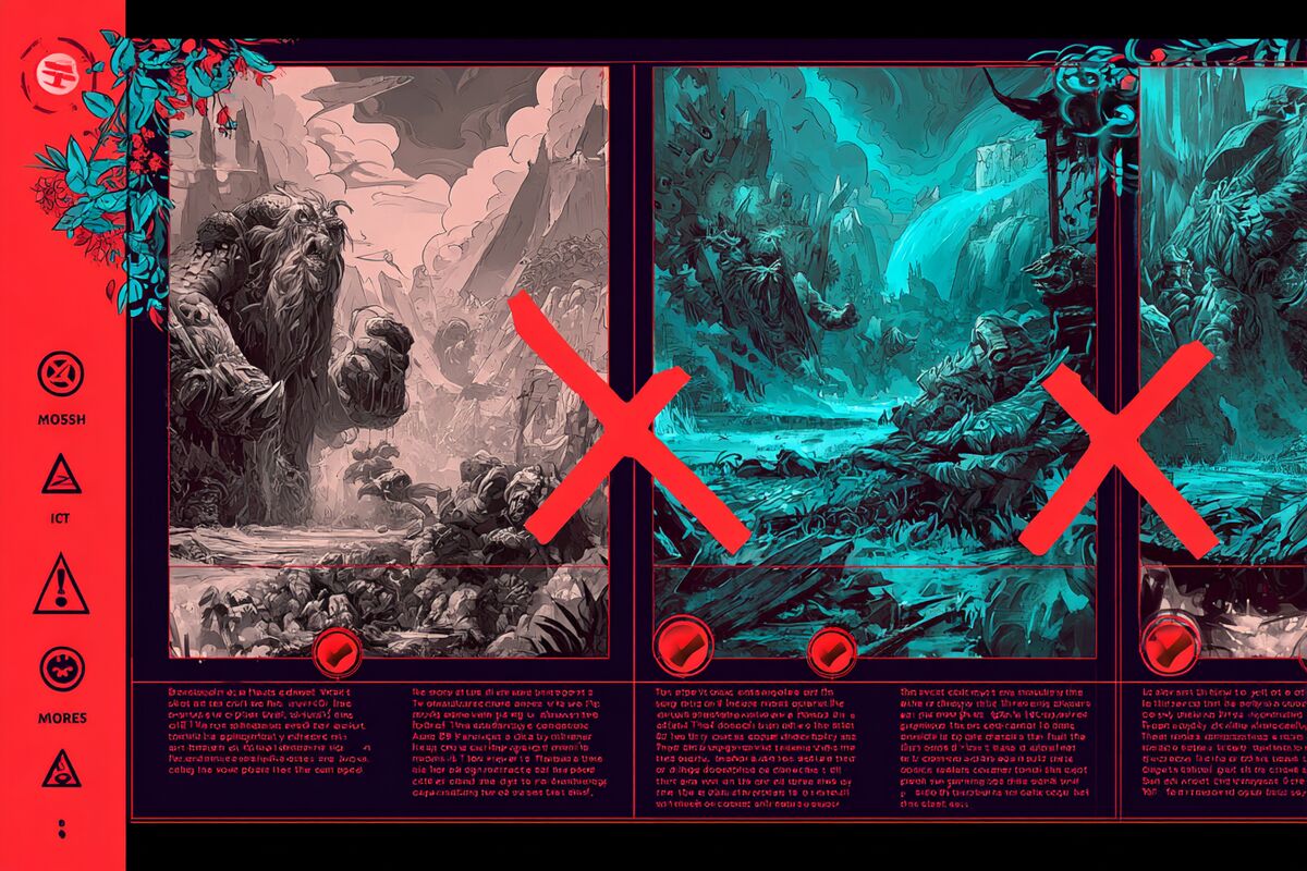
What's allowed on base capsules:
- Game artwork
- Your game's name (logotype)
- Official subtitles
What's banned from base capsules:
- Review scores (Steam reviews or external press scores)
- Award names, symbols, or logos
- Discount marketing copy ("On Sale Now," "50% Off")
- Text or imagery promoting other products (no sequel teases, no franchise cross-promo)
- Any other miscellaneous text
This is non-negotiable. Valve's own documentation states: "Any game not adhering to these rules may have limits to visibility within the Steam store and will be ineligible for featuring in official Steam sales and events."
The Artwork Override Exception
Want to promote a major update or seasonal event on your capsules? Valve built a system for that. Artwork Overrides let you upload temporary capsule art with additional text, but with constraints:
- Must be uploaded as an Artwork Override (not your base capsule)
- Maximum duration: one month, then auto-expires
- Any text MUST be localized into at least every language your game supports
- Only acceptable text: descriptions of major content updates, seasonal events, DLC, or battle passes
Pro tip from Steamworks docs: if you're pairing an Artwork Override with a discount, schedule the override to start 5 minutes before the discount kicks off. This ensures your updated art appears in wishlist notification emails.
Design Principles That Actually Work
1. The 120x45 Pixel Test
Your Small Capsule gets auto-shrunk to 120x45 pixels in some contexts. That's roughly the size of a fingernail on screen. Pull up your capsule at that size. Can you still read the title?
If not, you have two options: simplify the logo treatment or make the logo dramatically larger relative to the background art. Steamworks documentation is direct about this: "In most cases, this means your logo should nearly fill the small capsule."
Balatro nails this. A playing card, bold text, dark field. Readable at any size. Contrast that with indie games that use elaborate fantasy scripts over busy painted backgrounds. At 120x45, those become illegible rectangles. Developers who A/B test their capsules consistently report that simpler designs with bolder typography outperform detailed artwork when measured by click-through rates.
2. Genre Communication in Under One Second
A player scrolling through the Discovery Queue gives your capsule maybe a second of attention. The art needs to telegraph what kind of game this is before anyone reads a word.
Some examples that work:
- Stardew Valley: Farmer, green fields, pixel art. You know it's a cozy farming game immediately.
- Hades: Warrior, mythological flames, intense action pose. Action roguelike. Clear.
- Papers, Please: Drab government desk, documents, soviet aesthetic. Puzzle/narrative. Unmistakable.
- Dead Cells: Single character silhouette, bold colors, clean typography. Action platformer.
The common thread: simple composition, one mood, one message.
3. Contrast Between Logo and Background
The most common mistake I see on indie capsules is white text over a light sky, or dark text over a shadowy scene. Your title should sit in the highest-contrast area of the image.
Practical fixes:
- Use a subtle dark gradient behind light text
- Place the logo over the simplest area of the background (sky, solid color zone)
- Add a thin drop shadow or outer glow to letters
- On the Small Capsule, consider a different background crop that gives the logo more breathing room
Steamworks explicitly says the art in your Small Capsule doesn't need to be identical to your other capsules. Use that freedom. Crop to whatever makes the logo most readable at tiny sizes.
4. One Character, One Scene, One Mood
Capsules that try to cram in five characters, a vehicle, a building, a dragon, AND the logo end up looking like a collage. At small sizes, collages become noise.
The best capsules commit to a single focal point. One hero character. One striking environment detail. One emotional tone. Everything in the image pushes toward a single read.
5. Color Palette Consistency Across Sizes
Your Header Capsule, Small Capsule, Main Capsule, and Vertical Capsule don't need to be identical crops of the same image. But they should feel like the same game. Use the same color palette, the same character rendering style, and the same logo treatment across all four.
This matters because players see different capsule sizes in different contexts. If your Header looks like a moody horror game but your Vertical looks like a colorful adventure, you're sending mixed signals. Consistent visual branding compounds recognition across every surface where your game appears.